
How to Bake a Dispersion Pattern from Scratch
I’ve built a realistic golf shot dispersion simulator and I’ve shared it for anyone to use.

.jpg)
I wanted to write about variance in golf here, but when I was reviewing my theoretical, idealized dispersion patterns, I realized it was effectively pointless to start discussing variance in golf without generating realistic dispersion patterns. These golf shot dispersion patterns represent the inherent variance in the game, so we need the model to reflect them before looking at birdies and blow-ups.
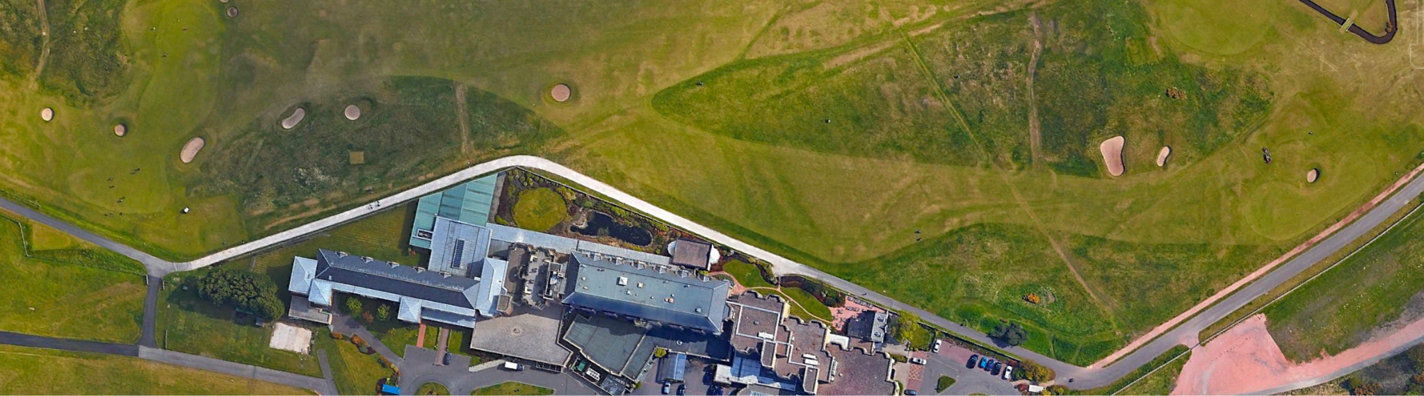
Note: this is going to be very technical. There will be a lot of footnotes. For technical folks following along, I’ve opened the source for this dispersion pattern generator. I’ll try to break this up by adding the resulting dispersion patterns, and overlaying them onto the road hole at St Andrews.
But First, Data
To build a shot dispersion model I’ll need data. The ultimate irony here is that plenty of datasets exist, it’s just that 1) I don’t have access to them, and 2) the owners of any datasets I could get access to would almost certainly not allow me to publish much with relevant parts of that data.1 Thus, I’m forced to scour the internet for any datasets that have already been published.
Note: if you work at a golf data analytics company willing to share data, please reach out. Access to large datasets would dramatically help in building an accurate dispersion model. I would like to make the model public even if the underlying data remains private. I will publicly shout out and thank any company willing to assist every time I discuss the model in the future.
Existing Public Sources
Thankfully, there is quite a bit of data out there that I am able to access. I really appreciate the following work:
Mark Broadie: Every Shot Counts.2
Mark Broadie and Soonmin Ko: “A simulation model to analyze the impact of distance and direction on golf scores.”3
Arccos: Arccos Annual Driving Distance Report 2026 Edition.4
Shot Scope: Annual Golf Performance Report 2026 Edition.5
Shot Scope: “Approach shots: average proximity to the hole.”6
Lou Stagner’s newsletter: “Fairway Bunkers.”7
Hireko Golf: “Average Distance for Each Golf Club: The Complete Chart by Skill Level.”8
Finally, I found a dataset that claimed to be a Shotlink database with what appeared to be legitimate data from tournaments between 2015 and 2017. Because I couldn’t know for sure whether or not it was actual data, I only used it to fill in some gaps.9
The Process
What is the shape of our distribution?
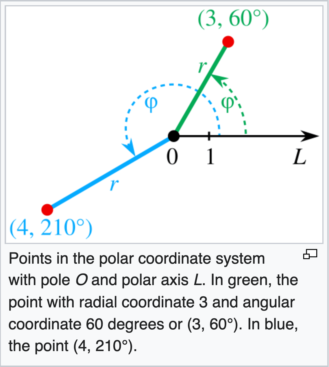
I started by building a theoretical dispersion pattern. The intuition on what it should look like comes from the model described in “A simulation model to analyze the impact of distance and direction on golf scores” by Brodie and Ko.10 Importantly, they use a polar coordinate system rather than a grid. This ends up being incredibly important and automatically scales the distribution as distance increases. The other important feature that Brodie and Ko’s model incorporates is a “good shot” and “bad shot” aspect for calculating how far the shot ends up going.
I chose a different approach to how “good shots” and “bad shots” are used in the overall dispersion because I wanted to include player handedness. Including player handedness allows us to skew the shot distribution long-left and short-right, which is one of the more important parts of the golf swing that can be lost in generalized data.
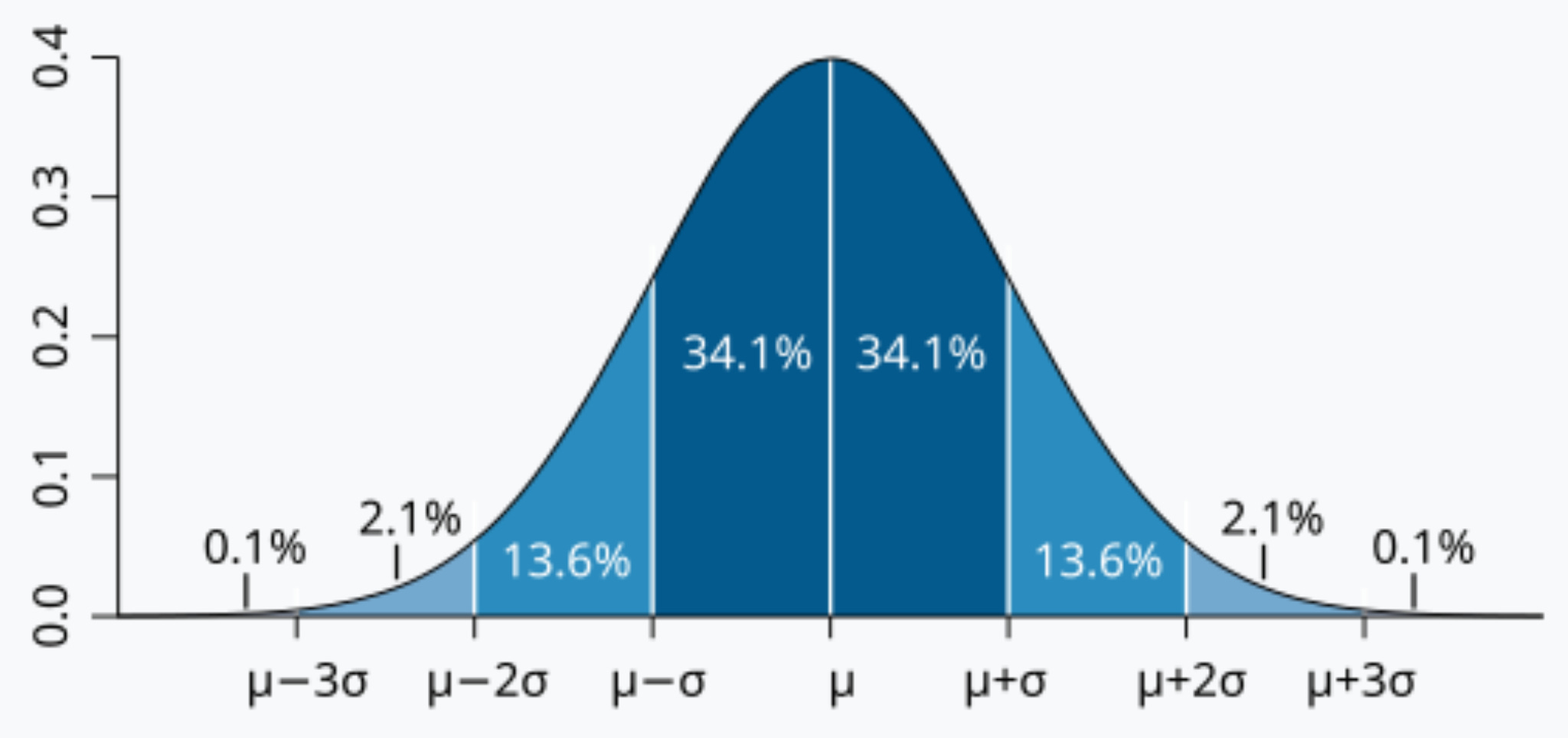
The “good shot” distribution is currently a normal, bivariate distribution along the polar coordinates. This, in hindsight, may be a mistake. A Student’s t-distribution might end up being more accurate to the existing data, and I will likely adjust the model in the future if that fits better.
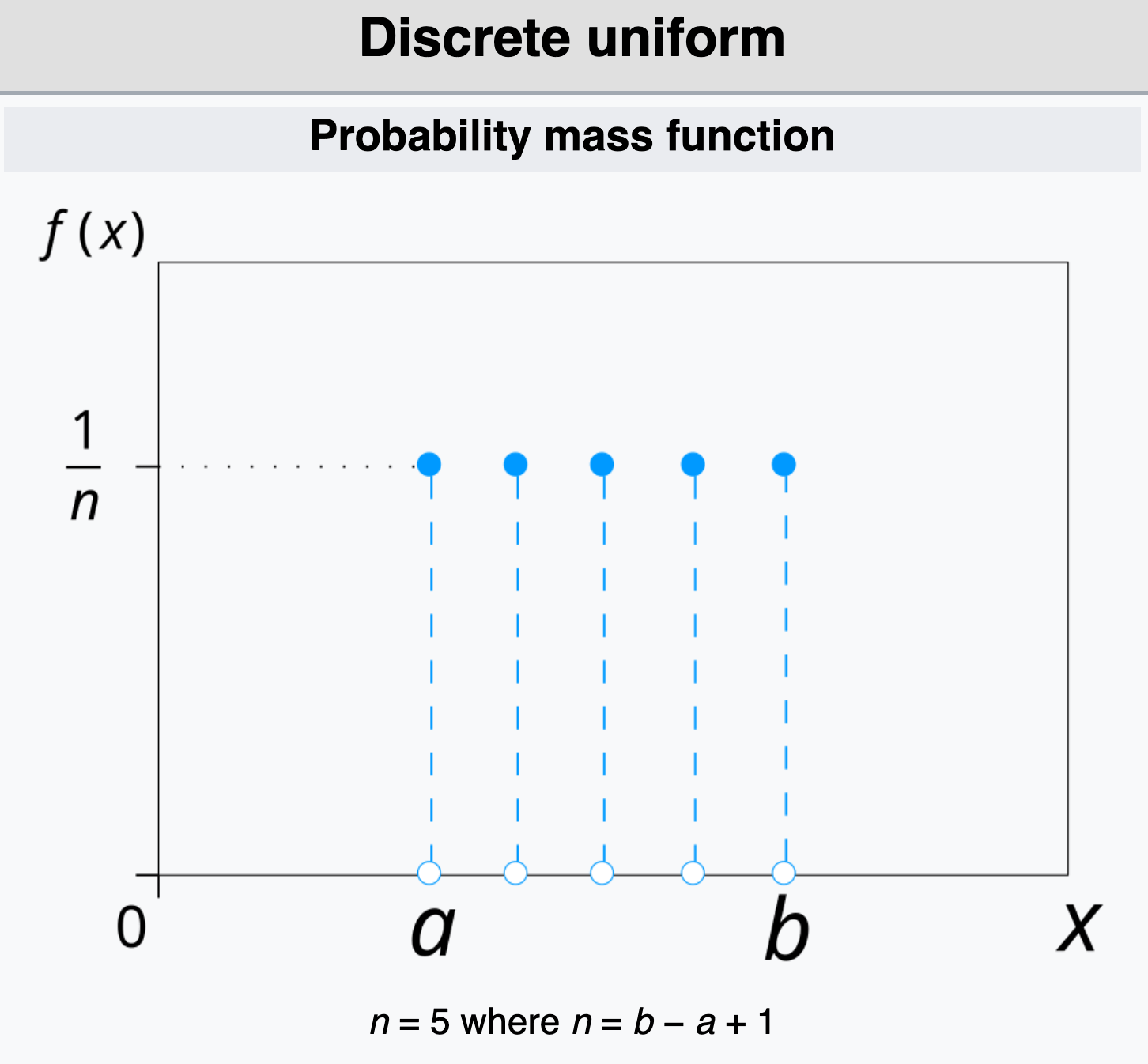
The “bad shot” distribution is completely different. The lateral error remains normally distributed where the shot misses left or right, but the distance of the shot is distributed effectively randomly. We should end up with a discrete uniform distribution.
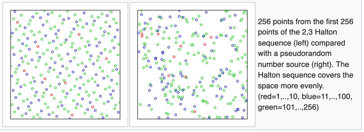
Note here that each of these distributions use methods that specifically prevent data from randomly clumping together. I do this so that the samples remain smooth across the probability distribution, avoiding the potential for random artifacts.11
How often do we see a “bad shot” and what does it look like?
It actually took a few attempts to find a good probability of a “bad shot.”1213 I finally settled on using Brodie’s “Awful shot scorecard” data from Every Shot Counts. Here, I was able to calculate a reasonable probability of “bad shots” simply by taking “strokes lost per round to awful shots,” and dividing it by the total shots taken by each type of player. This ended up being a fairly elegant solution that came very close to matching the few pieces of shot data I could find.
To determine the length of a “bad shot,” I eventually looked at the Shot Scope drive distance averages and the “well struck” drive distance averages.14 After trying a few different ways to interpret this data, I found that what works is to assume “well struck” driving distances were just the shots that averaged one standard deviation beyond the mean for all drives. This assumption yielded the most realistic results when compared to the one driving dispersion pattern I found. Knowing what a “well struck” drive looks like means we can calculate what a “poorly struck” drive looks like and how far we should expect it to go. With this realistic distance delta between good and bad shots, we can set a ceiling for how far our poorly hit shots should travel.
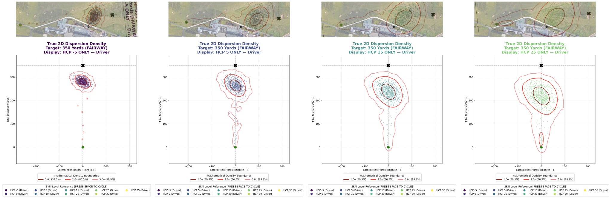
Some arbitrary adjustments: handedness, physical limits, and chunks.
The only thing I added arbitrarily, without any supporting data, is a tilt in the dispersion patterns. I was simply unable to find a dataset with dispersion patterns of golfers based on handedness.
Right-handed players tend to miss long-left and short-right because of swing dynamics. I’ve been fitted for clubs, and have seen my dispersion patterns across clubs. I just tried to eyeball this adjustment. It should not significantly change the data, but if anyone has any idea how to base this adjustment in reality, let me know.
Next, pure distributions tend to scale beyond realism. Shots should be limited by the physical limits of the players hitting the ball. There really isn’t some tiny probability that a 15 handicap blades a 6 iron 400 yards. It’s never going to happen. To account for this I apply a “squish” to the distribution, where shots long are squished down within a limited theoretical max distance. I also skew shorter shots even shorter to reflect the way fades tend to balloon in the air. It’s a minor adjustment, but it is meant to represent how air resistance should affect shots, and should affect longer shots more than shorter shots.
Finally, I apply an adjustment so that shots do not finish behind where they started. Instead of changing the entire dispersion pattern, I just add another “squish” where shots that end up too short or behind the starting point are proportionally squeezed into the five-yard area in front of the starting spot. This should represent chunked shots pretty well.
Next, scale the distribution to fit the data.
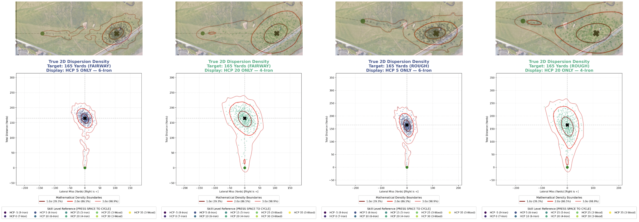
What we have now is a kind of arbitrary “shape” to the data; it looks a bit like a teardrop. However, this shape is effectively theoretical, and we need to fit that shape to a size that reflects how people actually play at different handicaps. We actually have quite a bit of data that helps us do this in Mark Brodie’s book, Every Shot Counts. There he lists fairway and rough “median leave” data that allow us to know exactly how many yards the median shot in our dispersion pattern should be from the hole from different distances.
This is probably the most important step in the entire process. We adjust our distribution to reflect the data by adjusting its scale repeatedly until it reflects reality. We do this by simply expanding or contracting the variance of the distribution, over and over, until we’ve found the scale of the variance that most closely matches the data. Once we have the appropriate scalars for each distance in the dataset, it’s fairly straightforward to fill in gaps between the other distances and other handicaps. This works great for shots from the fairway and rough, but things are more difficult from bunkers.
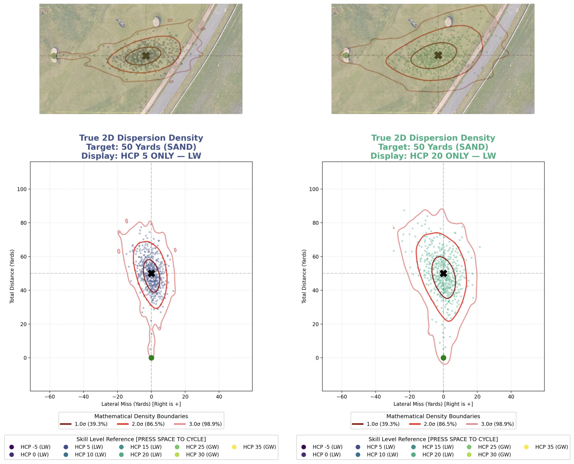
We can use the same median leave calculation for short sand shots in Brodie’s data, but that data only exists for distances inside 40 yards. We can extend this a bit with Shot Scope’s data, but that data is vague at best. Unfortunately, I haven’t found any real distribution data for bunker shots over 100 yards.
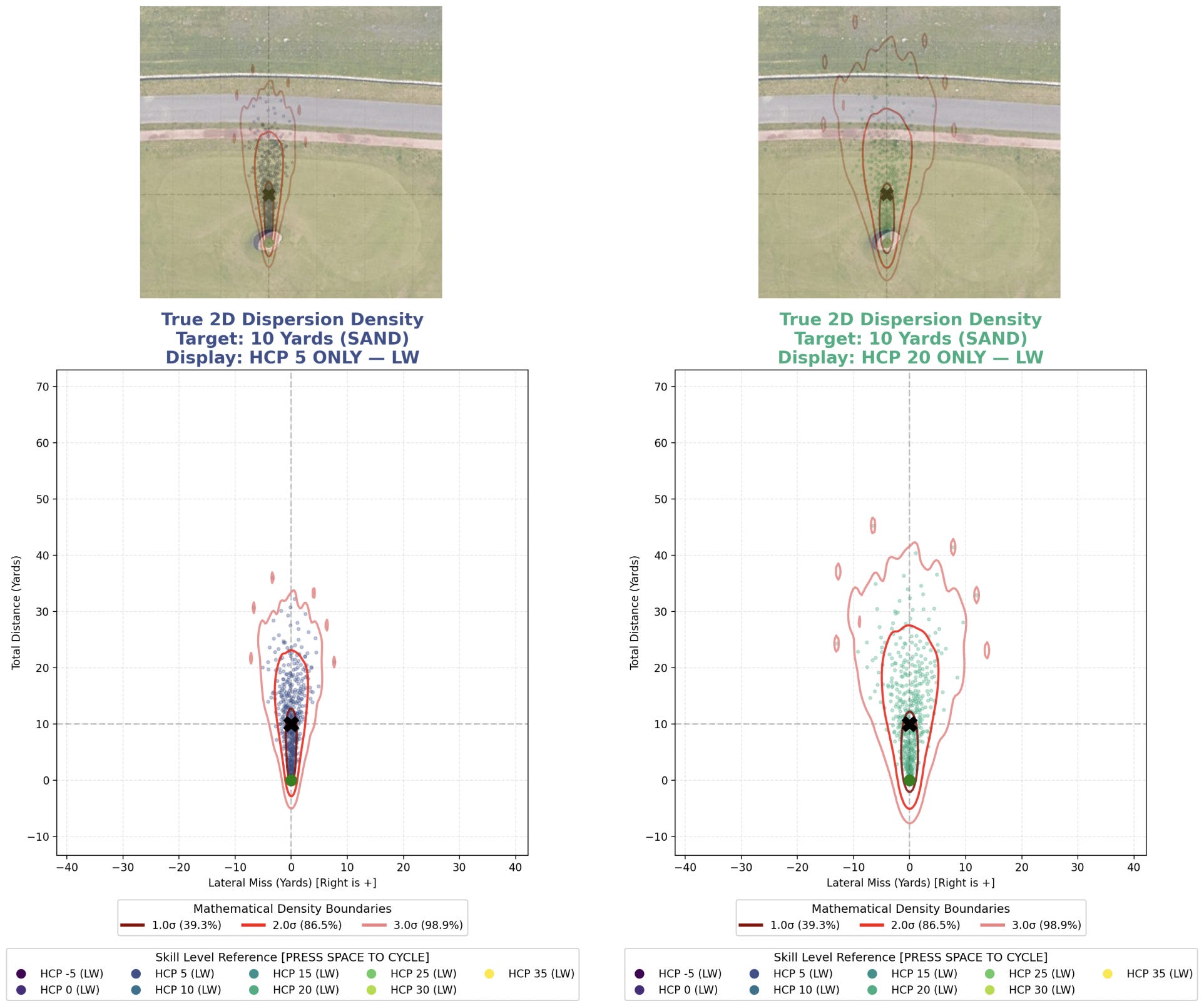
To try to address this as accurately as possible, I incorporate Lou Stagner’s dataset to calculate the “distance penalty” for long shots from sand. To find a distribution, I have to turn to the Shotlink data and hope it’s accurate. I use that to calculate the distribution changes for pros between fairway and sand, and then assume those ratios scale to higher handicaps. It’s synthetic data, yes, but I don’t really have any other way to guess at the shape of these distributions.
Club Selection is an Afterthought
When we think of a player hitting a golf shot, each club has a different distribution pattern and ideal distance. Unfortunately, the model basically does the opposite. The distributions are based on the distances we’re hitting, but we can then choose a club that should best match that shot.
Ultimately, we get our club distance data from Hireko Golf (which in turn cites its data from Shot Scope, TrackMan, and Arccos. I’m not happy about all these abstractions, but this is what I’m working with). I thought about adding an error to the output of a club for hitting it shorter than one optimally should – e.g., applying an increasing distance error for hitting a 6 iron the length of a 9 iron to simulate a low runner – but doing this opens up so many potential problems that it’s just not practical right now. So right now the “club used” remains effectively arbitrary.
Results: After Many Iterations, A Reasonable Output
We’ve set up our distribution using ideas based in theory. We’ve tied that theory to the data using scalars. The result is that any shot at any distance hit by any handicap on any surface can be modeled. And it can be modeled to a “reasonable approximation” of reality.
It’s certainly not going to be perfect. And it really can’t be. We’re modeling data averages, when the actual differences in shot type between individuals is pretty large.15 Ultimately, that actual data from humans does exist, most people just don’t have access to it. However, for illustration of general concepts, it should be reasonable to fall back on this kind of general model.
Creating a shot pattern now takes four inputs: distance, lie type (fairway, rough, sand), player handicap, and player handedness (to flip the dispersion tilt for lefties). We also add in the number of shots we want simulated. We sample shots more evenly than we would expect from data to reduce noise, because our goal is creating architectural heatmaps.16
I also built a visualizer that shows where shots are most likely to finish and with general probabilities. This makes it easier to see the main dispersion area around the target and the larger miss patterns outside it.17 The main purpose of the visualizer is to see if our results are completely out of touch with reality. And at first, they were.
Throughout the development process, I’ve been comparing my model’s output to Broadie and Ko’s work. They have three published dispersion patterns, and I compared these outputs at each stage of development to look for obvious mistakes. It took quite a bit of tinkering to get outputs that seemed reasonable.
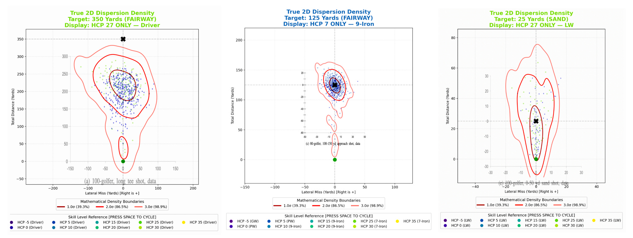
As we can see above, the final results should reasonably approximate the existing data. It’s not perfect, but I’m working with very little here, and these researchers had direct access to datasets that should make the process more straightforward.
I am very open to suggestions for improvement.
If anyone is interested in working on this with me, reach out. Again, better and more plentiful data should obviously lead to a superior generalized model. I think I’ve done a fairly reasonable job here, but when real player data already exists, any model like mine will be inferior. Thus, I see no reason not to share the code with others to help improve it. If you want to help make it better, you can find the code here on github, just maybe be nice about the fact that a significant amount of the code was LLM assisted. I’ve released it under an MIT license so anyone can use it.
It will take a bit of time to actually connect this dispersion generator to the architectural mapping model, but when that has happened, we should see much, much more realistic architectural visualizations. I still need to build a putting model, and that will come, but now I should be able to talk about variance in golf design much more realistically.
The PGA Tour’s Shotlink database is probably the best known. However, launch monitor companies have this data across every metric I could imagine for doing advanced modeling: Trackman, Foresight Sports, Uneekor, FlightScope, Full Swing, Garmin, TruGolf, and ProTee. The golf tracking apps also have enough data to make this model pointless: Arccos, Golfshot, 18Birdies, DECADE Golf, Clippd. Unfortunately, even though there are all these companies holding (likely near-identical) datasets, this data isn’t just given away (nor should it be).
Broadie, Mark. Every Shot Counts: Using the Revolutionary Strokes Gained Approach to Improve Your Golf Performance and Strategy. New York: Gotham, 2014.
Driver accuracy in degrees:
Skill levels: Pros, 80-, 90-, and 100-golfers.
Fairway and rough median leave data:
Skill levels: Pros, 80-, 90-, 100-, and 110-golfers.
Yard groupings: 10-20, 20-60, 60-100, 100-150, 150-200.
Sand median leave data:
Skill levels: Pros, 80-, 90-, 100-, and 110-golfers.
Yard groupings: 10, 20, 30, 40.
Awful shot scorecard:
Skill levels: Pros, 75-, 80-, 85-, 90-, 95-, 100-, 105-, and 100-golfers.
Strokes lost per round: “awful total,” “awful long game,” “awful short game,” and shots per round (by definition from skill level grouping).
M. Broadie and S. Ko, “A simulation model to analyze the impact of distance and direction on golf scores,” Proceedings of the 2009 Winter Simulation Conference (WSC), Austin, TX, USA, 2009, pp. 3109-3120.
Arccos Annual Driving Distance Report 2026 Edition. Arccos Golf, May 2026.
Average men’s driving distance by handicap and age (they also provide distances for women).
Skill levels: 0.0–4.9, 5.0–9.9, 10.0–14.9, 10.0–14.9, 15.0–19.9, 20.0–24.9, 25.0–29.9, and 30+
Ages: 15-19, 20s, 30s, 40s, 50s, 60s, 70s, and averages of each.
Annual Golf Performance Report 2026. Shot Scope, 2026.
Driver averages by handicap:
Average type: total average, “well struck” average.
Handicap groups: 0, 5, 10, 15, 20, 25.
Tee shot dispersion:
Miss types: left, right.
Handicap groups: 0, 5, 15, 25.
Proximity from 150 yards and 30 yards:
Handicap groups: 0, 5, 10, 15, 20, 25.
Proximity types: high distance, low distance, average distance remaining.
Directional miss percent from 100 yards by handicap:
Handicap groups: 0, 5, 10, 15, 20, 25.
Direction miss: right, left, long, short.
“Approach Shots: Average Proximity to the Hole.” Shot Scope Blog, Shot Scope. 24 August 2020. Accessed 4 July 2026.
Average proximity from “60 to 100 yards” by handicap:
Handicap groups: 2, 8, 14, 20, 26.
Surface types: fairway, rough, sand.
Average distance per club by handicap:
Handicap groups: 2, 8, 14, 20, 26.
Clubs: 4i–9i.
Stagner, Lou. “Fairway Bunkers.” Lou Stagner Golf, no. 51, 8 Mar. 2024.
However, the data here comes from Arccos.
Fairway bunker average distance by handicap:
Handicap groups: 0, 5, 10, 15, 20.
Distances: 105, 114, 125, 135, 145, 155, 165, 175, 185, 195, 205.
Summitt, Jeff. “Average Distance for Each Golf Club: The Complete Chart by Skill Level.” Hireko Golf, 13 Apr. 2026.
However, the data here actually comes from: “Data sources: Shot Scope (handicap segments), TrackMan (PGA Tour), Arccos 2025 (driver averages). All figures are carry distances in yards.”
Men’s Average Golf Club Distances:
Handicap groups: 5, 15, 25, male pro.
Clubs: D, 3w, 5w, 3h, 4i–9i, PW, GW, SW, LW.
I was unable to extend my sand shot dispersion model beyond 75-ish yards. So, I took this apparent Shotlink data and I mapped the fairway dispersions, rough dispersions, and the sand dispersions from buckets of distances. Then I basically took that error delta at each distance, and then mapped the sand dispersion to the rate of difference we would see in the area of fairway-rough-sand relationships in the sections of sand we already have verified for higher handcappers. This allowed me to extend the sand shot data to all distances and handicaps.
I think it’s a pretty cool hack, but it’s the kind of thing where if I just had access to player data it would likely be much more simple and accurate.
Broadie and Ko 2009
I use a Halton sequence (qmc.Halton) so that we have a fairly uniform distribution, simply because this should improve the quality of the mapping software I’ve built. By leaving the distributions completely random in their samples, I open up the possibility of just having random artifacts rather than a general probability distribution being created.
I initially tried to determine the probability of a poorly hit shot with the Shot Scope miss quadrant data (Shot Scope 2026), assuming that excess in “short misses” represented actual misses, but this approach turned out to be a mistake.
There is a significant excess of “short misses” in the data. I’ve seen a lot of folks suggest that this is due to players misjudging their club distances. Shot scope provides the following analysis:
While overall skill and accuracy differ greatly by handicap, the tendency to miss short of the green with a wedge is a common theme across all levels, accounting for roughly 40% of all misses. This indicates that golfers of all abilities consistently under-club, or that there is a universal tendency to underestimate carry distance on partial wedge shots.
I had initially thought that this consistent missing short at all levels was an appropriate level of “bad shots” just stuck in what was otherwise symmetric data, but later on in the process I realized that this wildly overweighted short shots when compared to Brodie and Ko’s few published examples of data.
I then found Brodie and Ko’s “% Recov” tee shot data for 80- and 100-golfers and used these as two linear points for “bad shot” probability, but there was no way to set a baseline for better players. This meant there was no way to really generalize the data based on existing data, and I was just making arbitrary guesses.
Shot Scope 2026
Shot Scope 2026’s “Driver Distance Distribution” dataset shows this very clearly.
The result is generated by pseudo-randomly, technically, using the quasi-Monte Carlo method with a Halton sequence (qmc.Halton) for both good shots and bad shots.
I built a visualizer that uses a kernel density estimation so I can see the areas of the distribution that are approximately one, two, and three standard deviations away from the target.